Say Goodbye to Background Clutter: Remove and Replace Backgrounds with aiTransformer Background Editor - Advanced
In the previous post: Say Goodbye to Background Clutter: Remove and Replace Backgrounds with aiTransformer Background Editor - Basics, we talked about the basic operations of aiTransformer Background Editor and how to choose the suited images. Now let's discuss in detail about the options after selecting the new background image.
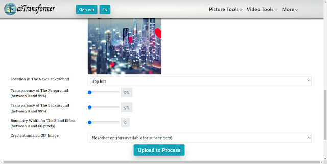
Once the new background image is selected, additional options will appear, including the location in the new background, transparency of the foreground and background, boundary width for the blend effect. Subscribers also have the added option of creating animated GIF images with fade-in or fade-out effects on their foreground or background, which can be a fun and creative way to add some movement and visual interest to designs.
Finding the optimal combination of parameters for your project may require some experimentation and patience. Adjusting the location of the background image, or changing the transparency levels to try to find the right balance between the foreground and background, may need more than a few tries. However, the time and effort will be worthwhile when you finally get the ideal picture.
Let's explore the parameters in detail one by one, hopefully, this could give your some ideas and save your time when doing your own project.
1. Location in The New Background
There are nine location options to select from when placing a cut foreground picture onto a new background image: top left, top center, top right, center left, center, center right, bottom left, bottom center, and bottom right, as illustrated in the following pictures.
 |
| nine positions can be chosen |
Tips: It's
crucial to note that when repositioning an object within a background
image, the dimension of the foreground image shouldn't be larger that of the background
image. The background image serves as a frame, determining the final size of the composition. If the foreground image is equal to or larger than the background, the isolated object will remain centered, regardless of where you attempt to move it.
2. Transparency of The Foreground (between 0 and 99%)
Adjusting the transparency of the foreground can help blend it with the background seamlessly, resulting in a more natural-looking composition. It is especially useful when the foreground has sharp edges or has a different color or texture from the background. Additionally, in some cases, a larger transparency can create a liquid-like transparent effect.
 |
| Top left: 0%, Top right: 30%, Bottom left:60%, Bottom Right:99% |
3. Transparency of The Background (between 0 and 99%)
When working with images, it's important to ensure that the main subject stands out and grabs the viewer's attention. However, sometimes the background is busy or distracting, when it comes handy to adjust the background transparency. By adjusting the transparency of the background, you can make it less prominent and bring more focus to the foreground.
 |
| Top Left: 0%, Top Right:20%, Bottom Left:50%, Bottom Right: 80% |
4. Boundary Width for The Blend Effect (between 0 and 60 pixels)
When editing an image's background, adjusting the blending boundary width is useful for a smooth transition between foreground and background. The boundary width determines the area where the images blend - a narrow boundary may seem abrupt, while a wide one may seem blurry. Adjusting the boundary width can help you create a seamless blend and make the resulting image look more natural. Besides, for animal pictures, a wider boundary can create a fluffy effect.
 | |
| Top Left:5, Top Right: 10, Bottom Left: 20, Bottom Right:60 |
5.Create Animated GIF Image
Subscribers also have the added option of creating 8 kinds of animated GIF images: fade in foreground, fade out foreground, fade in and out foreground, fade out and in foreground, fade in background, fade out background, fade in and out background, fade out and in background.
_4_7_1.gif) |
| foreground fade in and out |
Another example
_8_7_1.gif) |
| background fade in and out |
We have created a video that showcases a ghostly effect by utilizing a GIF file and the background editor. The video is composed of two GIF files, using the foreground fade-in and fade-out effect. The first GIF file has its foreground positioned at the Bottom Left, while the second is placed at the Center. Both files use the same foreground and background pictures. However, to create a sense of distance, the foreground image in the second GIF was resized to 40% of the size used in the first GIF. This combination of elements results in a ghostly effect in the final video.
That's all for now. Get ready to try it yourself.


Comments
Post a Comment